Drawing a Ring-Tailed Lemur
Drawing a Ring-Tailed Lemur: Building Roundness in the First Layer
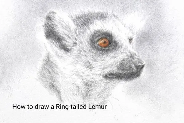
In this blog post, I share my techniques for drawing this lemur portrait, which cover the first layers.
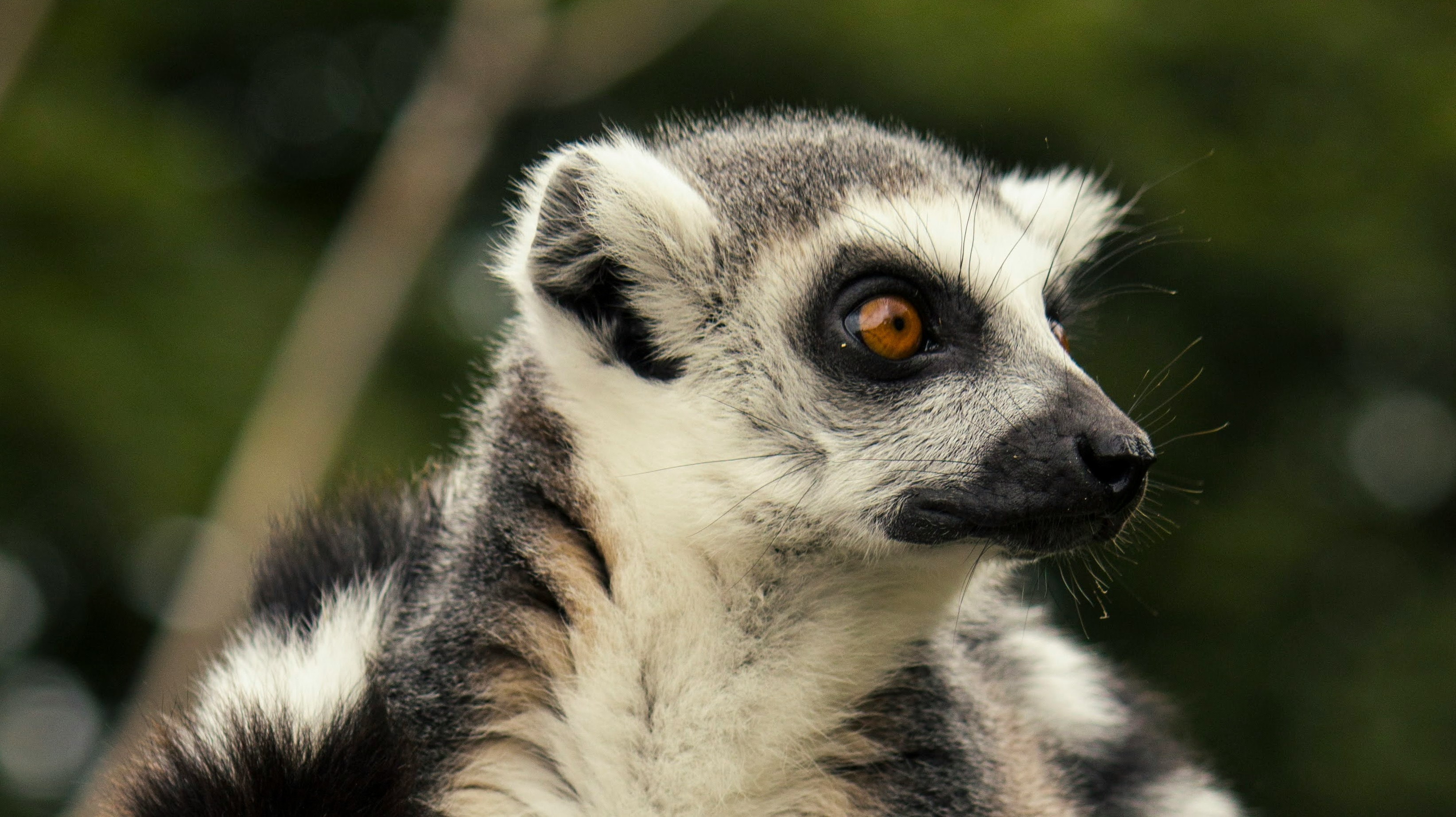
This month's draw-along in the ANIMAL ARTISTS ACADEMY is this sweet little ring-tailed lemur, and what a gorgeous subject he is! The reference photograph is by Rebecca Campbell on Unsplash, and while the full image is quite complex, we're focusing on just the head to keep the session around an hour. You're very welcome to take it further if you'd like.
I worked almost all of him in graphite, but he has such a beautiful little amber eye that I couldn't resist doing that part in coloured pencil. Members have both a colour and a black-and-white reference in the portal, so you can work in graphite only, mix the two as I did, or do the whole thing in colour.
What to Look For Before You Start
At first glance, he looks a little complex, with all that speckled fur, and it's easy to get pulled into drawing every hair. Try not to overcomplicate it. What really matters here is keeping the roundness of the head, and that roundness comes from subtle changes in value rather than from detail.
There are a few areas I'd like you to pay particular attention to. His centre line is subtle, with a small white patch dividing the head, but it's important because it gives the head structure. The soft white fur around the edges of his ears and under his chin has lovely rim lighting, so we need a background behind him, or those whites will simply disappear into the paper.
The muzzle needs some care too. There's a round bulge, then a dip, and then the lip is also round, so it's subtle and delicate, but it needs to be put in correctly. And finally, the bowl of his ear. It looks white, but compared with the lightest spots nearby, it's actually a value down, so it needs a very light graphite covering to read as a hollow.
Materials
Graphite: Mars Lumograph 2B and 3B
Coloured pencils (eye only): Faber-Castell Polychromos in Black, Light Yellow Ochre, Terracotta, Brown Ochre, Burnt Siena, Burnt Umber and Cold Grey II
Paper: Arches Hot-Pressed 300 gsm
Background: 2B graphite scraped into powder, a tissue or soft cotton ball, and a puffer
Erasers and blenders: kneadable eraser and a small makeup sponge
That's quite a few pencils for one small eye, and you could certainly use fewer, but since it's such a small area, we may as well enjoy them.
Starting With the Eye
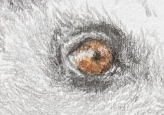
I always start with the eye because once he's looking back at you, the whole drawing comes alive. I started with black, gently popping in the pupil and dark rim, then moved on to Light Yellow Ochre, working from the lightest colour with very light, directional strokes. It's quite a strong colour, so I kept it soft and stayed off the outer edge, which is a little darker.
I went over it with Terracotta, then Brown Ochre for the little shadow at the top of the eye. Compared with the yellow ochre, it's darker and slightly bluer, yet closely related in hue, which makes it ideal for that shadow. A highlight in Cold Grey II goes right across, shining over the pupil as well, and a touch of Burnt Sienna on the edge darkens it and helps the eye look rounder. Burnt Umber just off the pupil and a few small circular strokes indicate the shadow falling across the top, and then a couple of tiny Cold Grey II highlights where he's catching a little light.
One thing I noticed later on: once I had the darks in around the eye, it suddenly looked a bit too yellow, so I went back in with another quick layer of colour and darkened the pupil again. Colour always reads differently once its surroundings are in, so don't be afraid to revisit it.
Moving Into Graphite
The black Polychromos pairs nicely with graphite, making the transition around the eye seamless. My point was sharp but not super sharp, because the edges around the eye need to be gentle.
I always lay down a base layer in 2B first, then come over it with 3B. The 2B just sits on top of the paper and can be modified easily, which is exactly what you want in this first, controlled layer. Using medium pressure where things need to be darker lets you get some values happening early, and you'll notice that as soon as you go dark, the surrounding areas immediately look lighter. That's the value relationship doing its job.
Building Roundness in the Fur
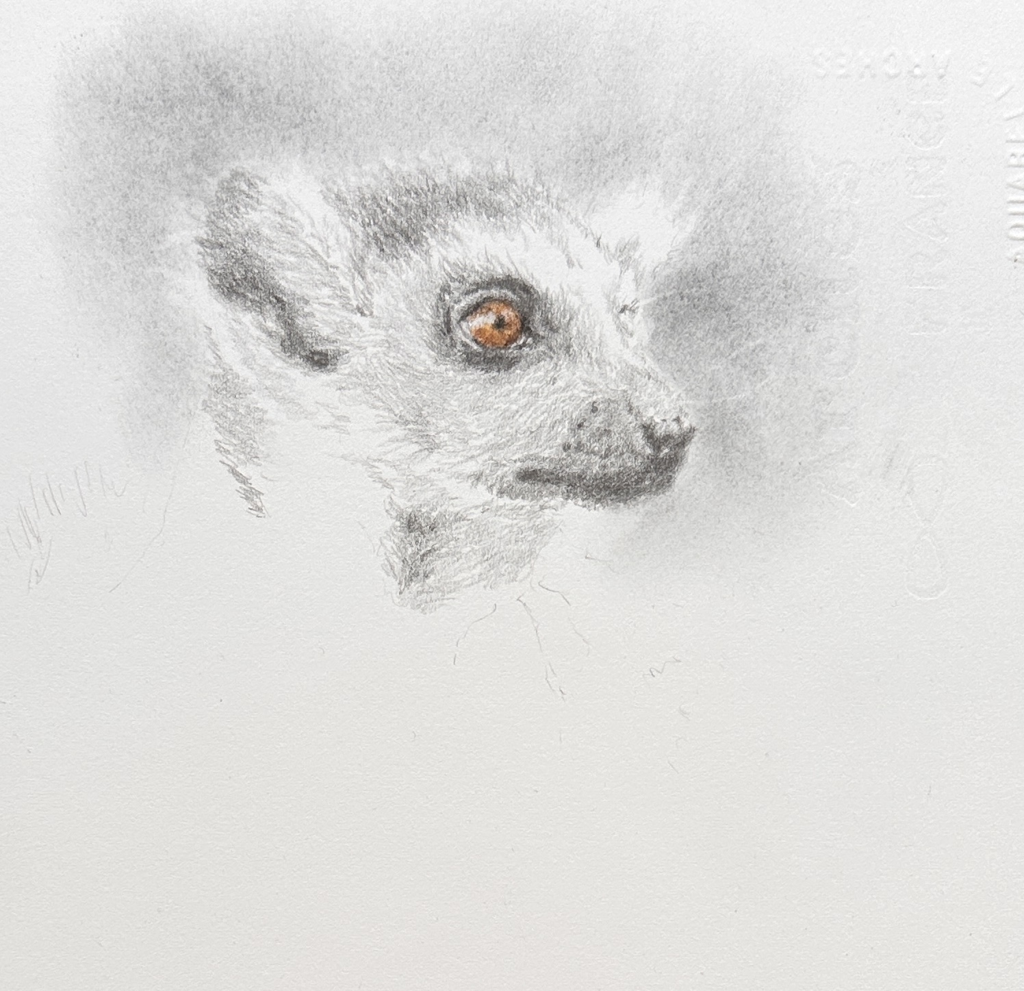
For the head, I used short, linear strokes to mimic the length of his fur, and left a small gap of white paper down the middle for that centre line. If you lose it, just lift it back out with your kneadable eraser.
At this stage the head looks fairly flat, and that's fine. To bring in the roundness, go back over it with a second layer, starting on the side that falls into shadow and following the curve of his head with your strokes. There will still be enough white paper showing through, and you'll see the form start to appear almost straight away. A third layer softens it further and makes the fur look more realistic.
Those Subtle Whites
The light on this little fellow is really lovely, and it's subtle. Even though areas of his ear and cheek look white, they're actually just a value down from the three or four brightest spots, so they need the lightest possible touch.
It doesn't matter if you exaggerate these slightly, because photographs often bleach the whites out a little. What matters is that it makes sense value-wise. If you go a touch too dark, just dab gently with your kneadable to lift the value back.
The Muzzle and Nose
On the bridge of the nose, the hair starts going every which way, so I simply used small elliptical strokes rather than trying to copy all the detail the photograph shows. A subtle shadow line along the edge of his nose helps define the hair, and a dark dip under the muzzle gives it shape.
His nose dips back into a leathery texture with some lovely darks, and there's a tiny spot of light on the damp part of his nostril that's worth saving. This is one of the reasons I chose him. He's a wonderful practice piece for textures, with leathery skin, a glassy eye and soft fur all in one small area.
It's always worth standing back at this point to check your values and make little adjustments.
Keeping the Neck Simple
The neck sits gently in shadow, so it doesn't need much detail. The detail belongs up around the face, and the neck just needs the values to sit correctly so it supports the head without competing with it.
A Soft Graphite Powder Background
For the background, I scraped some 2B into a little pot with a knife. I keep different shaped pots for each grade, so I know which is which. You can apply it with a tissue, a cotton bud, or a soft cotton ball, or scrape the powder straight onto the paper and work it in, which I did this time to show you another method. Keep your tissue flat and wrinkle-free, and rub it in gently.
Be careful around the edges. On a finished drawing, I'd use a finer tool, but even this quick version shows how effective it is at making that soft, pale fur glow. A puff of air clears the loose powder, then you can gently shape the edges with your kneadable eraser or a small makeup sponge.
To finish, I lifted out a few fine whiskers using the thinnest edge of the kneadable I could make. If they're not quite right, just go over them with the tissue again. I also popped back a softer highlight on top of his head, keeping the edge gentle because that fur is short and soft.
What Comes Next
That's the first layer! For the second layer, go over everything again, sharpen your 3B, and use a bit more pressure to make those darks really rich, especially in the ear and around the nose. After two or three layers, you'll really start to see him take on more dimension. Soften anything that needs it with your kneadable, and add a little more detail where it counts.
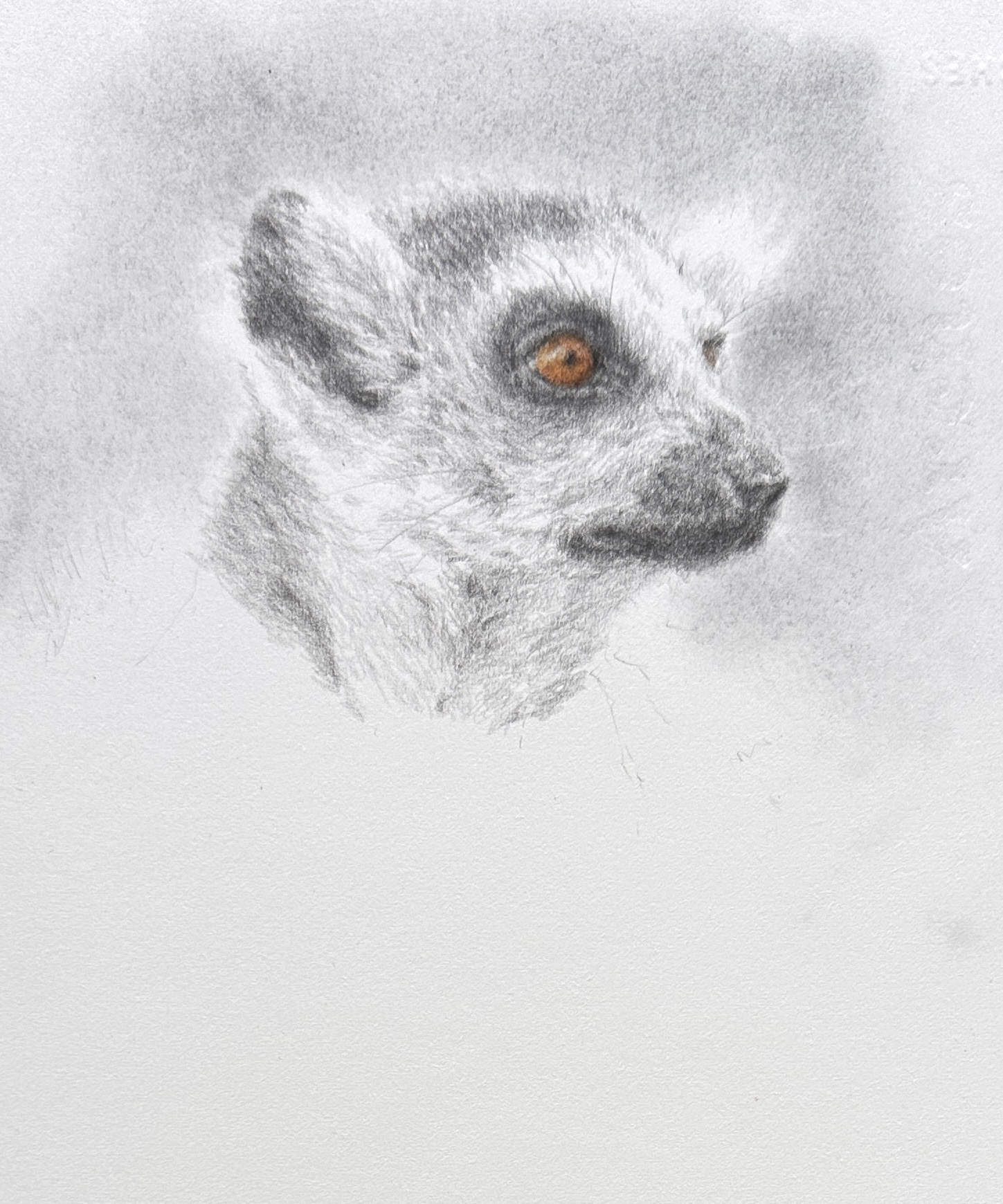
He's a sweet subject and well worth the time, especially if you want to experiment with different fur textures and lengths, plus a soft background. So enjoy him and have fun.
If you'd like to draw along with us each month, come and join our supportive community inside the ANIMAL ARTISTS ACADEMY: https://katejenvey.com/animal-artists-academy