Why I Always Come Back to Three Primary Colours
Why I Always Come Back to Three Primary Colours
This question comes up a lot when students first begin working with colour, especially coloured pencils: "Why are we spending so much time on just three colours when my tin has hundreds in it?"
It's a good question. But the three primaries, red, yellow and blue, are the foundation of every other colour you own. And when you understand how those three behave, you understand your whole tin.
Why Coloured Pencils Are Trickier Than They Look
Coloured pencils present a different challenge than paint. With paint, you physically blend colours on your palette, and pigments can separate. Add white to viridian, and it swings noticeably blue, because that's the main pigment sitting underneath.
You can't do that with coloured pencils. If you pick a viridian green straight from the tin, all you can do is lighten it using the white of the paper. You can't break it back down into its blue and yellow. Instead, you mix through layering, which is exactly why coloured pencils reward you for going back to your primaries whenever you hit a problem.
What a Limited Palette Actually Teaches You
Working from just red, yellow and blue feels limited, and in a way it is. But it's a much better place to start than reaching for forty pencils, which can be overwhelming, because it forces you to understand how colour really works rather than relying on whatever comes manufactured straight from the tin.
A few things it builds:
Colour confidence and mixing ability. Once you know your secondaries (orange, green, violet) and your earth tones, such as umbers, ochres and greys, all come from these three, colour stops feeling like guesswork.
Observation skills. With only three colours available, you're forced to really look. Is that brown warm or cool? Is the shadow leaning red or blue? You don't have another choice to reach for, so you have to think it through.
Harmony. Because every colour in the piece comes from the same three, you're far less likely to end up with muddy mixes. If an orange needs toning down, you already know a touch of blue will do it, and that blue is already living elsewhere in the artwork.
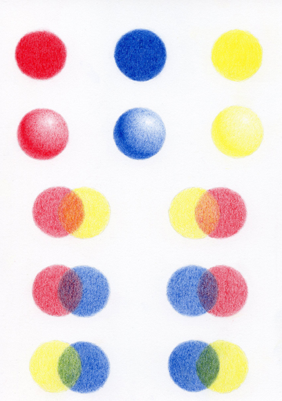
I like using the little sphere exercise for this: draw the same coloured circle twice, then turn each circle into a sphere with a highlight, a core shadow and a touch of reflected light. Then cross two circles over, mixing one orange (for example) by laying red first and the other by laying yellow first. It's simple, but it teaches pressure and layering better than almost anything else I set.
Breaking Down 'Difficult' Colours
Whenever you're stuck on a colour, ask yourself: is it warm or cool, and is it light or dark? That's usually enough to work out your mix.
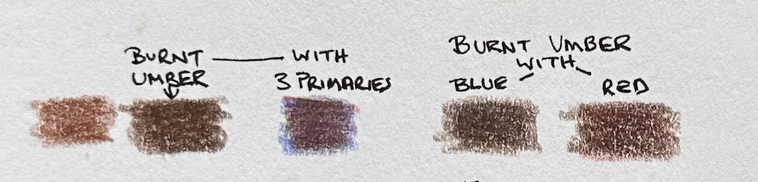
Take burnt umber, a dark warm brown. Since blue is the darkest of the three primaries, start with a solid layer of blue as your base, add red for warmth (you will mix a dark violet), then add a touch of yellow to neutralise that violet back down to brown. Want it darker and warmer still? Add a little more red.
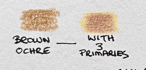
Brown ochre works the same way but lighter: a soft layer of yellow, a light layer of red to bring it to orange, then a small amount of blue to neutralise it into that earthy ochre tone.
Black is the one people assume needs a black pencil. It doesn't. Any dark, neutral colour- blacks, greys, browns- needs all three primaries because that's what neutralises vibrancy. Layer your blue first, add a deep red, then a touch of yellow, and you'll get a rich, believable black rather than something flat.
What About Warm and Cool?
This is the tricky one, and it came up again on a recent call. The honest answer is that a colour is rarely warm or cool on its own. Red is always warm, but there are warm and cool reds, and It’s warm or cool relative to what's next to it.
To identify a colour's temperature, see whether it leans toward red or blue. The darker it is, usually the more blue it contains, and therefore will be cooler
Yellow ochre is a good example of a colour that genuinely sits on the fence; it has both red and blue in it, so it can look warm or cool depending on what you place beside it.
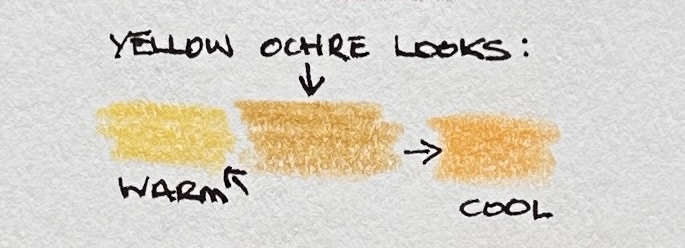
If you're not sure, swatch a few options side by side on scrap paper before committing. You're not looking for a rule that works every time. You're training your eye to compare.
A Personal Lesson From Painting
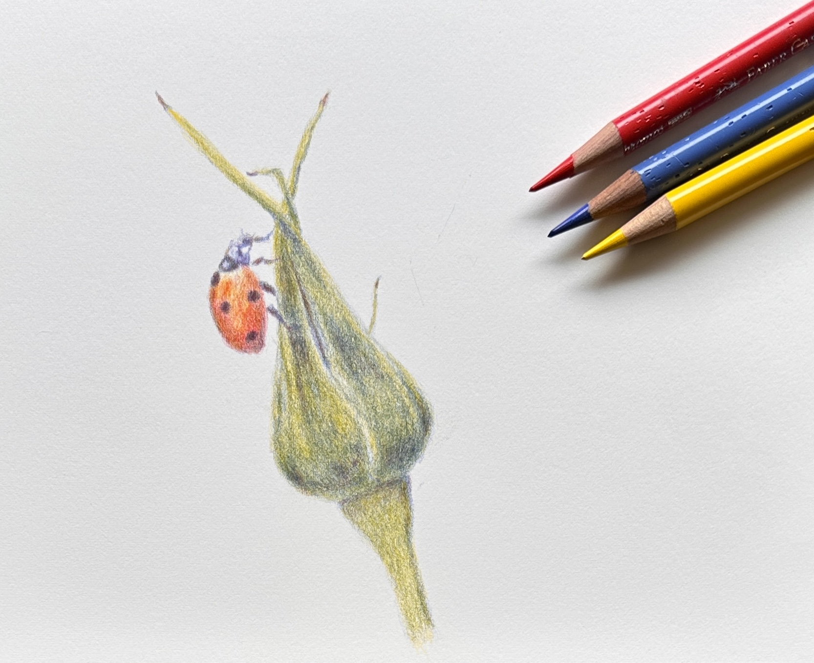
I got completely lost with colour when I first started painting. I picked up a book on painting for beginners titled ‘Fill Your Oil Paintings with Light & Color ’, by Kevin Macpherson, and the advice that changed everything for me was simple: whenever you get stuck, or even before you start, come back to your three primaries plus white.
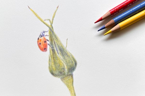
I did painting after painting using only those three colours, and it taught me more about mixing colour than anything else I'd tried. Here is an example from a tutorial of mine using just three primary colours.
Common Mistakes to Avoid
- Heavy pressure too early. It stops you from layering and mixing properly. Work light, and build up gradually.
- Reaching for a new colour at the first sign of trouble. The limited palette shows you how much variety you already have in three pencils.
- Ignoring temperature conflicts. A warm yellow ochre darkened with a cool black will usually go muddy, as will many other colours. Often when a mix looks "off," it's a temperature clash rather than the wrong colour altogether.
Try It Yourself
Pick a simple subject; a piece of fruit, an eye, a small patch of fur, and work it entirely in three primaries. Keep your paper small, so the exercise stays doable in an evening. It's a lovely one for travelling too. Pack white paper and three pencils, and you can work anywhere. Here is a short video to demonstrate what you can do.
If you'd like the step-by-step exercises I mentioned here (the apple, the duck, the colour wheel template and more), they’re all inside the ANIMAL ARTISTS ACADEMY, along with the video this post is based on.
If you have any questions about colour mixing, please let me know. I always enjoy going through these together with you.
Kate x